Behind the Rebrand: Formation’s Approach to Effective Rebranding
Your business is doing well, and things are going okay – but do you get the feeling there’s room for improvement? It could be your branding needs a refresh. Here, Formation designer Willem talks about the merits of rebranding and how to go about carrying out a successful rebrand for your business
In this article, you’ll discover:
- What is a brand?
- What makes for a successful brand?
- Why go to the bother of rebranding at all?
- How to rebrand:
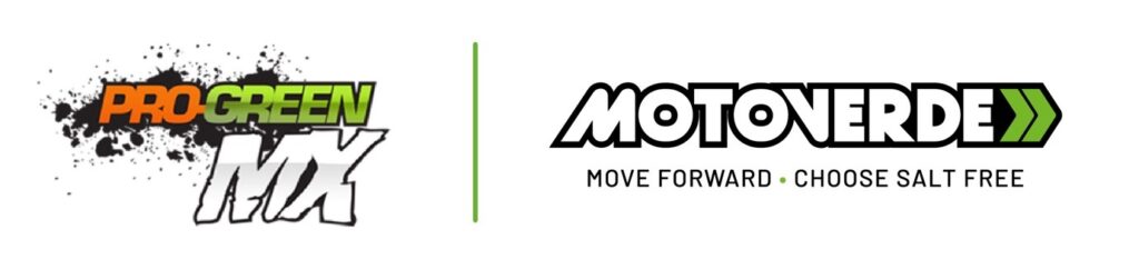
Pro Green MX – Motoverde
Aston Villa Foundation – Everybody’s Game
- Conclusion
What is a brand?
A brand is possibly the most important part of any brands’ brand.
By which I mean, being able to influence people’s thoughts with positive connotations when they think about your company gives you a tremendous amount of marketing firepower.
A quote about branding that’s always stuck with me is branding expert Marty Neumeier’s “A brand is a person's gut feeling about a product, service, or organization.”
When you think about branding like that, it makes it a lot more magical than reducing the whole thing to a colour palette or Nike tick.
A brand is more; a brand is how someone sees your company.
It’s a reputation.
Good examples of branding
When you think of Apple, it might conjure images of child labour or that thing that came out about how Apple intentionally slows your phone down with updates so you have to buy a new one more frequently. You might think Apple are bastards.
But you don’t.
Instead, you think of sleek, grey, modernist, objects of beauty that you would pay an arm and a leg for. You think of a history of disruptive, gorgeous, perfect technological devices and you think of their stylish, guru-esque, visionary founder, Steve Jobs.
Apple have managed to control their brand perhaps better than any other company in history. Yet; their gizmos are far from perfect. In fact, Apple products are intentionally designed with flaws, and their visionary founder, Steve, not only knew nothing of coding, Apple actually fired him and he remained outside their employ for several decades…
But that doesn’t matter!
Check the stock index and you will see, Apple are still coming out on top.
Apple have positioned themselves in such a way that despite all the above, their products are just too cool and too convenient not to buy.
Their phones as objects feel like an extension of your own hands; their packaging is just so crisp and clean, their use of black and white is just so striking and brave, and their shops are just so glassy and futuristic. Wow.
That’s what we think of when we think of Apple. That’s the power of a good brand.
What's rebranding - and what makes for a successful rebrand?
The Formation design team has a wealth of experience when it comes to rebranding. We’ve worked with engineering and manufacturing clients like Lawton Tubes and The Engineering Technology Group, and legal and financial clients like CTT Group. Brands make up a significant part of the work we do at Formation – and Formation make brands.
So why go through the process of rebranding?
Rebrands allow us to look at what makes your company special and then draw on those selling points to make it even better. As a business owner, they give you the chance to examine your company closely, and us as designers the opportunity to define its values and create visuals that target these goals even more precisely.
With this in mind, let’s take a look at two of my favourite Formation rebranding projects:
Pro Green MX – Motoverde
Pro Green MX is a company Formation has worked with before. At the time, they specialised in making salt-free cleaning products for motocross bikes. After a business partner left the company, Pro Green MX leant into this period of change and commissioned a massive rebrand from Formation. Pro Green MX, now Motoverde, wanted us to redesign and expand their entire visual catalogue to complement their growing product range.
As is the case with most rebranding prrojects, the best place to start was the logo.
Departing from the grungy, dirty paint splashes of Pro Green MX; Motoverde glides smoothly towards sleekness. The thick strokes of the semi-italic font (Strasua) combined with the contrasting, green double chevrons give Motoverde a sense of forward momentum and focus, combined with an aura of solidity. The black outline rounds off and contains everything nicely.
Logos are the stamp of your brand. They therefore have to be simple, solid and memorable. (Think the Pepsi swirl, The Puma puma, or McDonalds ‘M’)
As far as good places to start go, this one happened to be particularly good as a great deal of the new Motoverde visual language was built off the back of this logo.
A rebrand doesn’t have to just be a new coat of paint, though. It can be an important moment for a brand or business to decide on the direction it pivots. For Motoverde, it marked a move towards a wider range of salt-free cleaning products.
Back in the Pro Green MX dark ages, the product range stuck largely to bike spray – the end. But with Motoverde, the chance came to expand. And I mean expand! They brought its range of salt-free cleaning products not just to bikes but to cars, vans and even boats as well!
With this came more opportunities to show off the new and improved branding.
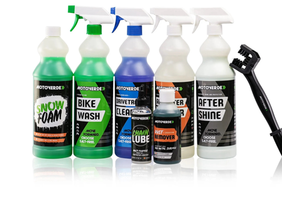
An important part of any brand is visual consistency. No point going off road when we’ve spent so long carving out the track. Continuing the theme of forward momentum, the Motoverde bottle designs followed the same right-hand leaning motif present in the logo. The sharp, decisive use of colour and shape gives a confidence to the brand that the messy grunge of Pro Green MX was never able to achieve. The use of the Motoverde chevron as a visual throughline really consolidates the Motoverde brand. It makes things concise, clear and obviously Motoverde.
Aston Villa Foundation – Everybody’s Game
Let’s kick the ball further up the pitch and talk about another high-profile rebrand that happened not long after Motoverde.
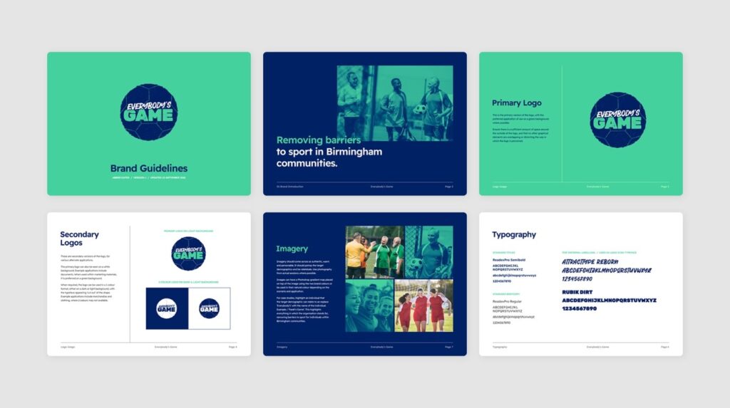
All of us at Formation were honoured when one of our neighbouring Premiership football club, Aston Villa, approached us for a rebrand of their foundation. The Aston Villa Foundation specialises in removing barriers to sport in Birmingham – one example of this is by providing female referees for Muslim football matches. The AVFC Foundation wanted a new identity to differentiate the foundation from the football club itself. It needed a new brand that matched its values of accessibility, inclusivity, and neutrality.
This time, instead of the logo first, we started with creating a new name – one that would set the foundation apart from the club itself. Everybody’s Game works on two levels: not only is the game of football for everyone, but everyone wants to play it!
Next, we made a start on the logo. Recent years have seen a trend with rebrands where branding agencies seem to be opting for cleaner and simpler logos. Or maybe just more boring, depending on your outlook.

Well not this time! This time instead of going for the smooth, crisp, hard, vector edges of something like Motoverde, we did the exact opposite.
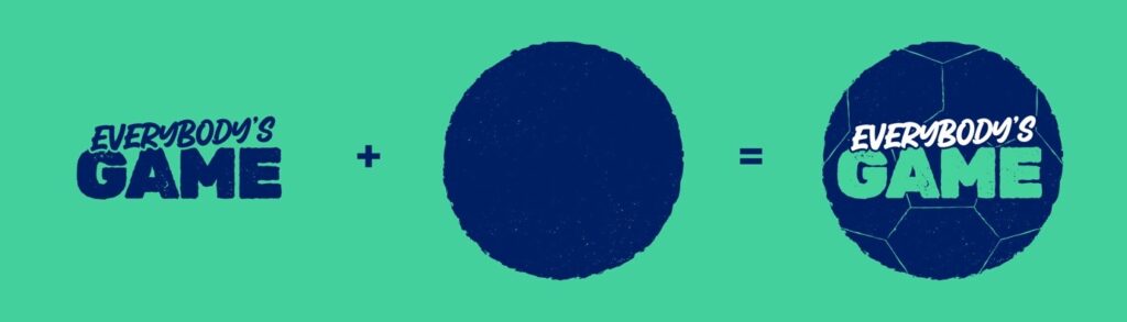
The visual alchemy of the Everybody’s Game logo is rather easy to explain.
- The circle shape, with its connotations of united community and sport
- A hand-drawn, friendly typeface, representing approachableness and relatability
- Granulated texture, as if the logo were an ink stamp, creating a casual and relaxed feel
Perfect. By doing this, Formation was able to create a logo that is not just nice to look at but also quite relatable. There’s an imperfect charm to the Everybody’s Game logo that makes it fun and confident but also completely unintimidating.
With our new brand values established and our logo looking good, further development was relatively simple.
The two main colours opted for were a deep blue and green. Blue is often associated with trust and peace. Green is often associated with nature and tranquillity. These colours were the perfect duo for enhancing the community driven force for good that is Everybody’s Game.
When it came to imagery, it was essential to show what Everybody’s Game does: bringing people from all backgrounds together. Men and woman from all different backgrounds were put front and centre of the brand, united by a shared love of football.
Rebranding: the conclusion
Brands might be “a person's gut feeling about a product, service, or organization” but rebrands are opportunities. For companies, it’s a chance to take a step back and ask yourself who you are currently and what you’d like to be. But for marketing studios like Formation, they’re a chance to show what we’re made of.
We get to look at where a brand is and re-imagine not just what it could look like, but more importantly, what it could mean.
Need help and advice with rebranding? Contact Willem and the team at Formation.