Improving the user journey for a global brand.
Sodick's website was confused and confusing
The company’s initial setup had around 28 mini websites for Sodick’s European distributors. These were fixed sites with minimal pages that distributors had no control over, meaning the information displayed was not always up to date or accessible.
In addition, the website’s navigation was far from user-friendly; its interface fell short of supporting Sodick’s multi-lingual client base and the design didn’t reflect Sodick’s industry-leading status.
Formation’s experience within the manufacturing sector and working with global OEMs made us the perfect partners to bring Sodick’s new customer-centric website to life.
Digital revolution:
Services
- Consultation
- Branding
- Graphic design
- Copywriting
- Web design and development
- UX design & user testing
Enhanced digital presence
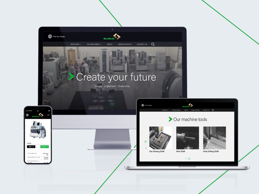
A key goal for the website was to boost Sodick’s online presence and establish better brand recognition while improving the user journey. We created a brand-new European website, engineered to support Sodick’s vast network of EU distributors and transform the customers’ online experience.
Using headless CMS architecture, the result is a network of enhanced e-commerce sites served by a single database of information. This approach allows Sodick’s European distributors to customise their own digital interface, so they can showcase their regional offering in keeping with the main site and its branding.
The customisable CMS caters for numerous product displays, reducing the time it takes for customers to navigate the website, source products, and compare Sodick’s various EDM machine solutions.
A European Focus
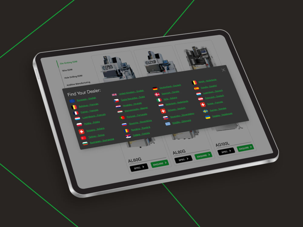
To meet the needs of its diverse European client base, we incorporated a multi-lingual function. We designed the website to accommodate varying text lengths, special characters, and multi-directional reading, so users can enjoy the same optimal experience on any digital device, using any of the supported language options.
“The website is essential for representing Sodick across Europe,” says Melanie Capp, Vice President at Sodick Europe. “Our high-quality product speaks for itself; we wanted to reflect this while also improving the customer’s overall experience.”
By putting Sodick’s distributors at the heart of the new website’s functionality, we were able to improve its focus on the needs of its end users, no matter where they are in world.
A key goal for the website was to boost Sodick’s online presence and establish better brand recognition while also improving the user journey.
The website’s improved navigation comes via a ‘mega menu’ that makes it easy for users to find what they're looking for on any digital device including mobiles - a feature that’s been honed by Formation’s User Experience (UX) insights and rigorous user testing. Sodick Europe
Optimal user experience (UX)
The headless system we used to build Sodick’s site also delivers a smoother, faster browsing experience for online customers.
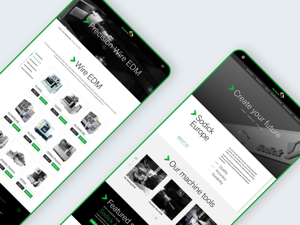
“We developed a clear and logical information architecture, organising content into meaningful categories and subcategories, so users can source information quickly and easily, ultimately improving the product selection.” explains May To, Formation’s UX designer and lead on the Sodick project.
The website’s improved navigation comes via a ‘mega menu’ that allows for a more comprehensive list of products to be displayed. This makes it easy for users to find what they’re looking for on any digital device – a feature that’s been honed by Formation’s User Experience (UX) testing.
Bold branding
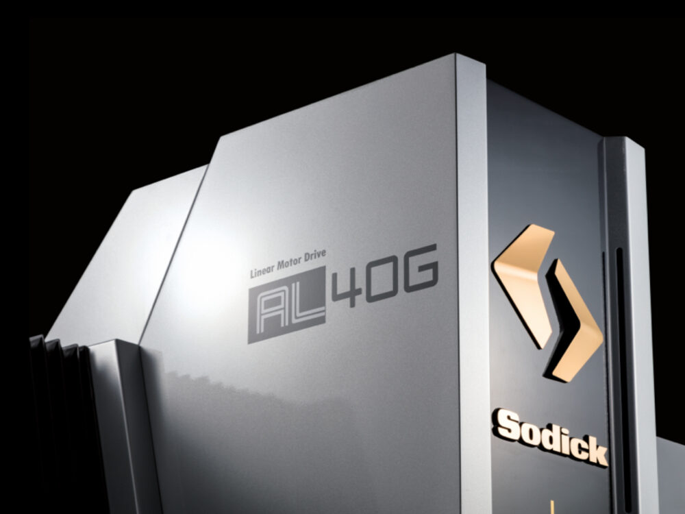
“We are bold and brave with no fear of doing things differently,” says Melanie of Sodick Europe’s brand values. To reflect this, we designed a visually striking website that mirrors the precision and efficiency of Sodick’s original product range while cementing their identity as a market-leader.
“It can be tempting for a machining company to lean into the oil stains, loud drilling sounds, and twisted-metal side of the industry,” says Formation’s Graphic Designer, Willem Davies.
“Instead, Sodick embraces the surgically sharp, computer-age side of machining. This inspired the bold, clean use of black, white, grey, and green. It’s impactful and instantly recognisable – like Sodick.”