Website for activewear brand given an adrenaline rush
Feel the Rush.
A sluggish website was not befitting a brand with a high-octane moniker. Poor navigation and useability made Adrenaline’s existing site difficult for customers to steer and negatively impacted their traffic and product sales. The user journey was no more straightforward for the Adrenaline team, and updating their content on the site was equally problematic. They wanted a slick, edgy and functional site that fully reflected their brand and its aspirations.
The Solution
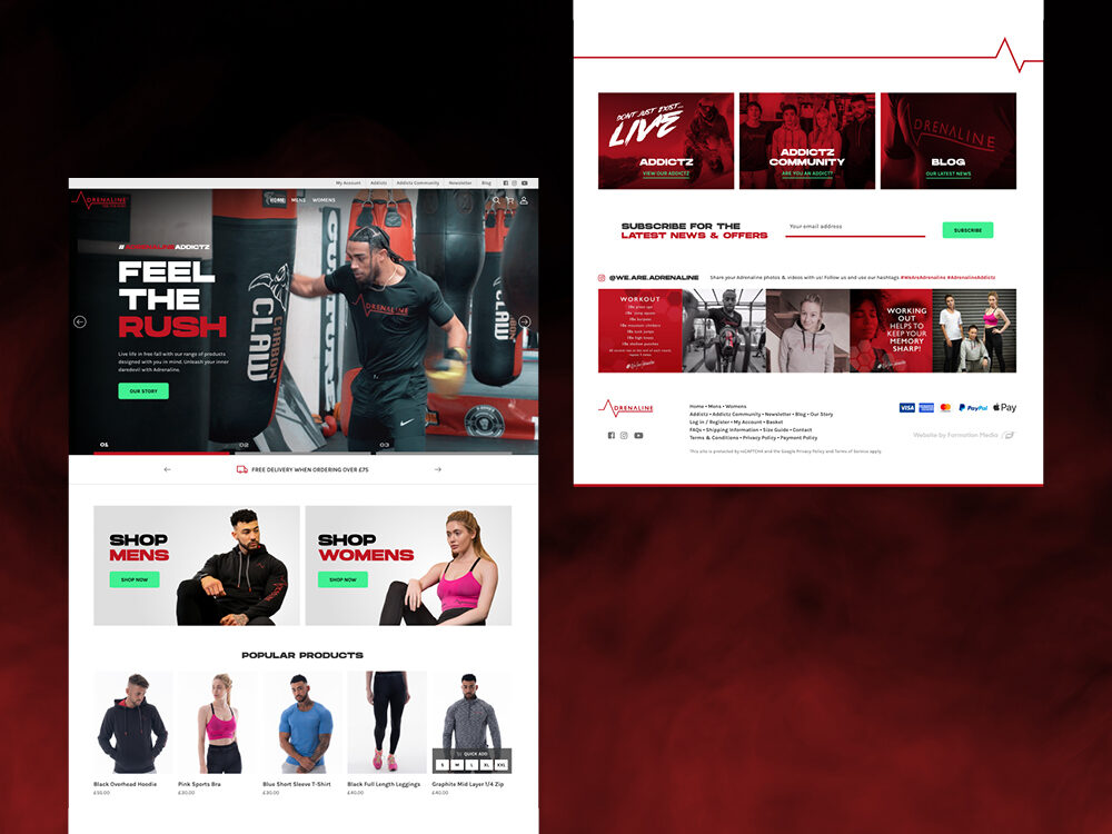
Formation resuscitated their brand image by building them a simple, clean and fully functional WooCommerce site with a drastically improved user experience for the customer and simple-to-use CMS for the Adrenaline team. They wanted to refresh their brand identity, so Formation set a new direction for the look and feel of their site by making their brand colours more prominent throughout the subpages
Services
- Web design
- Account management
- Web Development
- UX Design
- Graphic Design
- Consultation
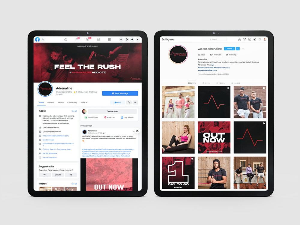
- Social Media Support
An easy-to-use content management system
The back end of Adrenaline’s previous website was clunky and difficult to use, meaning they found it hard to update, which contributed negatively to their website traffic and sales. Formation solved the problem with an intuitive and straightforward CMS allowing the Adrenaline team to easily update their product ranges, news and brand ambassador page. In addition, the page builder offers Adrenaline a detailed guide to enable the team to identify and add any features they require to their site with ease.
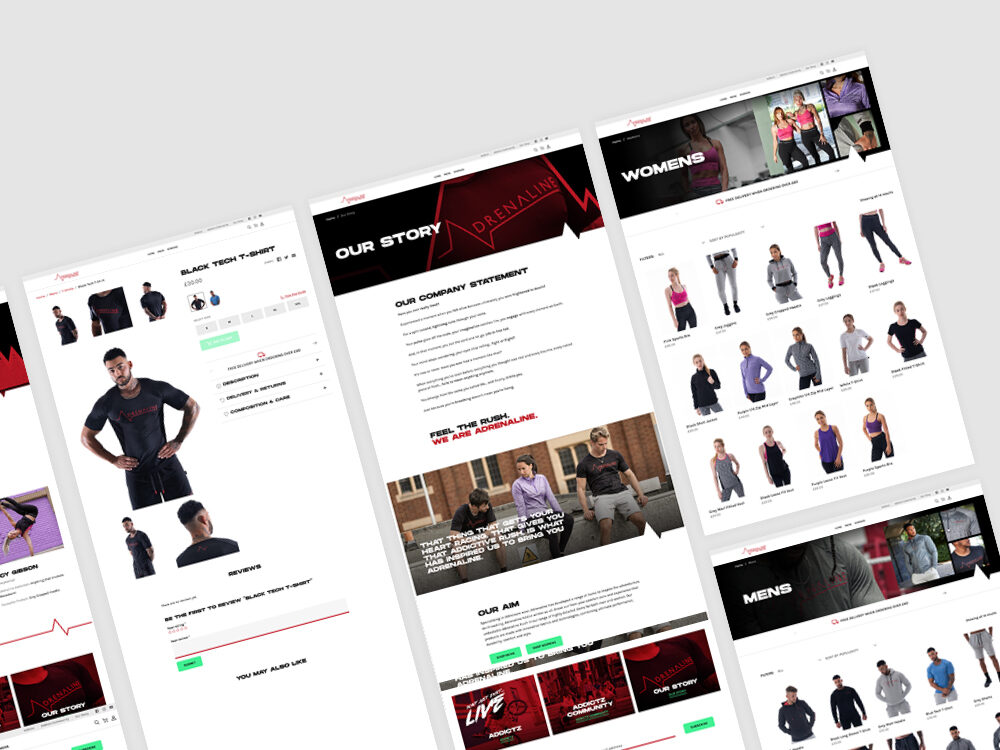
Bespoke Product Page
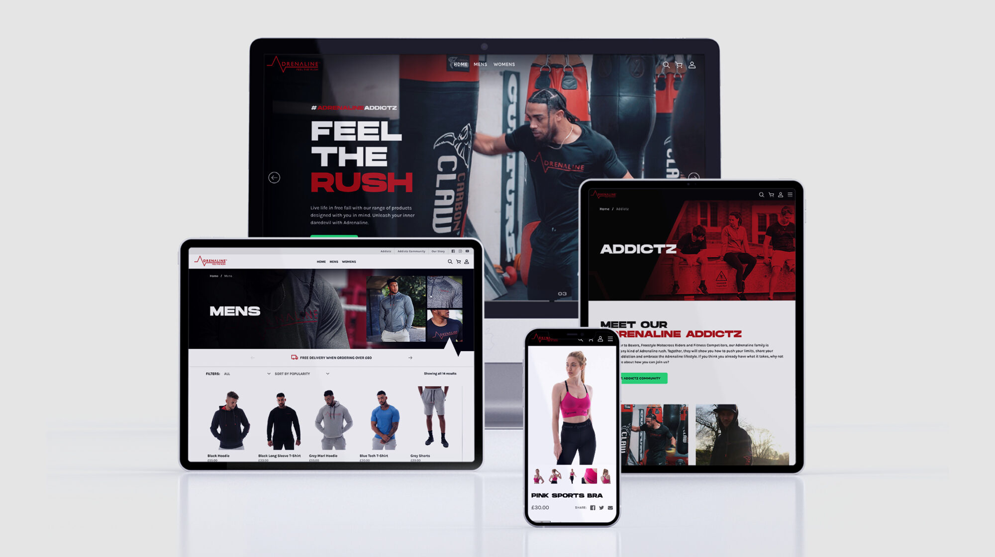
We designed a bespoke product page aimed at simplifying the customers shopping journey. A quick add function on the main page means customers can add items to their basket without clicking through to the product pages. In addition, high-quality model cut out photography sits within an easy-to-use carousel on the product pages that can be zoomed into, showing the garment details. This feature makes the user journey seamless and straightforward.
We’ve created a simple and user friendly customer experience for Adrenaline customers. The crisp, polished appearance website pages improve brand consistency and align with their aspirations as a high-end activewear retailer.
Brand Identity gets pumped
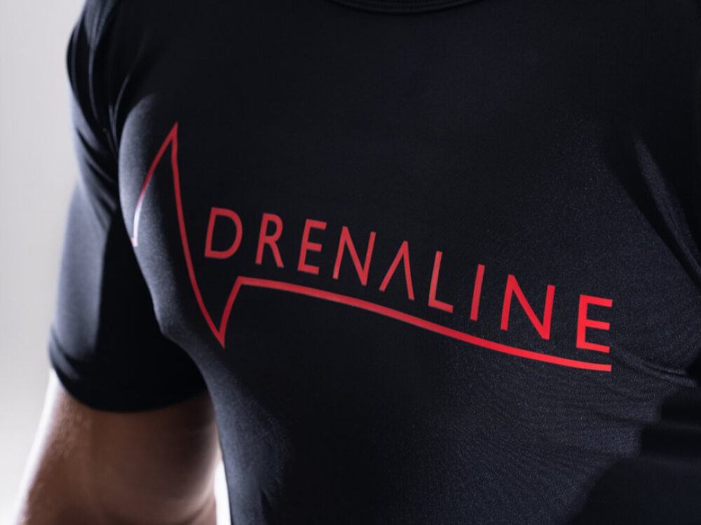
Adrenaline was keen to strengthen its brand identity across the site. New videos and edgy graphics were added to the homepage. The adrenaline brand colours were prominent and laced throughout the pages to provide a crisp, polished appearance that set a new look and feel. This improved consistency and matched their aspirations as a high-end activewear retailer.
Improved functionality
Adrenaline wanted cleaner navigation and a simple user journey. They asked for a dedicated section for their ambassadors and the ability to embed video content into the site. We also added a plugin to the new site, linking them to a fulfilment centre, enabling them to efficiently distribute their stock to customers without the headache of needing to pick and pack products themselves. Having a third party involved in the distribution of their products will allow the team more time to focus on the promotion and growth of their brand.
As always thank you for your support and kudos to the team for everything they have done. I am sure we can all agree how incredible the brand now looks and the difference is Heavens and Earth. This is our third full project we have worked on together and you have always delivered on absolutely everything and I can’t thank you enough for bringing my ideas to life Brad Smith, Director, Adrenaline