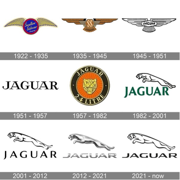
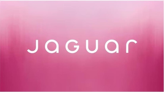
In the mildest possible terms, Jaguar’s new rebrand has been a disaster; but while many reactionaries are blasting the redesign as ‘woke’ we think there is something more interesting and nuanced going on.
A total rebrand is a hard thing to get right, as we’ve seen many times in the past. With Jaguar’s bold new direction causing as much of a stir in the real world as it is online, we thought it would be interesting to delve into what makes an effective rebrand by looking at one that hasn’t gone all that successfully.
By exploring the methods and aesthetics behind Jaguar’s new branding, we can learn how to avoid these mistakes in our own efforts to update the branding, voice, and personality of our clients.
So, where did it all go wrong?
You only get one chance to make a first impression
Jaguar as a brand is synonymous with tradition and class. It has its roots deeply entrenched in the British consciousness as a brand of luxury vehicles that embodies a sense of inherent style and quality.
The leaping big cat that graces the chassis of Jaguar’s vehicles is instantly recognisable across the world, but mainly in Britain, and is a symbol for power and speed, everything you want people to think about a car company – and now it’s gone. Well, not completely gone, but altered beyond all recognition, it’s meaning soon to be lost to time.

The growling image of the cat is also being retired. Too aggressive for the peaceful times of the mid 2020’s.
Established in 1935, Jaguar has a long history as a luxury vehicle manufacturer. Due to the joint pressures of dwindling sales and a push toward electric vehicles, the company decided to pivot to producing only electric vehicles starting in 2025. This led them to look for a bold new rebranding to match the bold new direction.

Oh my.
Willem Davies, Formation designer extraordinaire, had this to say, "The pathologic sans-serification sweeping modern brand logos like a virus is a symptom of a neurotic corporate world out of touch with consumer conscious.
If Jaguar cared, or even knew, what their customers thought, they would have kept the iconic logo that everyone knows them for. Instead, they have memory-holed their values and their legacy.
They have abandoned whatever it might have been that made them special and embraced brand entropy, the long, slow, inevitable gravitational pull that draws all brand values and visual identities to a dark, bland brand death. 2/10, worse than the GAP rebrand."
What a company says vs what a company does
There are certain things about a brand that become intrinsic, that is to say, they become part of the internal fabric of that brand.
In a person we would call this, having principles. You know what someone stands for because of what they do, not what they say; you can gauge what a person’s internal principles are based on these actions, and so it goes with brands as well.
Jaguar’s rebrand is bold, no doubt, but what is it saying about the company? If we look at it only on face value, completely on its own merits, what is it saying to us?
We have imagery of a kaleidoscope of people and colours, telling us this is a brand for everyone, that everyone is accepted, that no one is judged. Their founder Sir William Lyons, tells us they will ‘copy nothing.’ But what’s missing? Cars. There isn’t an automobile to be seen in this marketing for an automobile company.
A bold vision indeed and one that if Jaguar were a brand-new company, would not have raised nearly as much ire as it has; unfortunately for them, Jaguar is not a new company. They are a well-established company with a pre-existing reputation, one that is now entirely being dumped.
There are of course, larger trends at play here and why this rebranding seems to have turned everyone against them from almost every spectrum of life is because on one hand, it appears to be completely betraying the principles on which the brand was based; namely, to create high-end luxury vehicles and do it in an understated classy style synonymous with a sense of British elegance. On the other hand, it appears to be bluntly chasing trends, pandering to an audience that may or may not exist at all, having little or nothing to do with cars, instead focusing on gaining points with…… who? The press? Young people? LGBTQ+ people? Anyone?
It seems to scream superficial, something that Jaguar never has before. They are known for letting their actions speak for them, creating high-end quality cars with no need to ‘seek out’ an audience; things change.
And it is in embracing that change that all rebranding exercises should lie. There is nothing wrong with change. Life is full of it and often fighting against it is pointless in the long run. So, how is it that there are right ways to change and wrong ways to change?
Tapping into the zeitgeist is the dream of marketers the world over. But it is a bit like lightning in a bottle, you can’t force it, it just has to happen. Understanding the principles of a brand, is the first step in any rebranding exercise, and what Jaguar seems to say in its initial marketing push, is that they have no idea what their principles are or that they are willing to completely betray them to chase a zeitgeist that came to the fore about five years ago.
Why do some brands succeed, and others fail?
There is no objective aesthetic style, everything is up for interpretation and a company’s logo is something that can only be subjectively judged just like any other image…...but.
And this is a big ‘but’ and a reason many are rejecting Jaguar’s new look: everything we know now, is built on everything we knew before; nothing happens in a vacuum. Unfortunately for Jaguar, they have a long and storied history as another type of brand altogether.
Electric vehicles are famously dismissed and outright rejected by the wealthy conservative gentry of Great Britain (these people just so happen to be the main customers of Jaguar). What Jaguar had an opportunity to do was to communicate to their demographic why it is important to make the shift away from fossil fuels and embrace this new mode of transport. ‘Look guys, even we’re doing it, and we are the most traditional car company around!’ Instead, they have decided to alienate their customer base in a desperate move to gain a new one.
Ironically enough, one of the worst sins the rebrand commits is that it has no identity. It goes big and it goes broad, things to be commended, but you have to do it carefully. With a brand like Jaguar, one that may already be in a precarious financial situation, swinging and missing isn’t really an option.
History makes fools of us all
Now look, we hate to be quick to judge, apparently there are more reveals to come in the near future and who knows? We could all be wrong, and this bold new vision will work wonders for the company. They are set to unveil some car prototypes at an event in Miami on December 2nd, 2024, and perhaps we’ll all be eating a slice of humble pie.
We here at Formation love to see a good rebranding and to be honest, we’re just as excited to see great ones as we are terrible ones. Being aware of how to speak to your audience is something we very much pride ourselves on and seeing how others choose to do it is endlessly fascinating.
Identifying the how and why of a company’s choice to rebrand keeps us on our toes and our marketing senses sharp. And just so you know we’re speaking from a position of authority on the subject, take a look at some of our own rebranding efforts!