
This is not a drill! How poor UX design caused mass panic in Hawaii.
On Saturday morning Hawaiians woke up to the warning “BALLISTIC MISSILE THREAT INBOUND TO HAWAII. SEEK IMMEDIATE SHELTER. THIS IS NOT A DRILL” plastered on their mobile phones. Of course, we know now this was a false alarm, no missiles had been fired and Hawaii was under no threat, but it took 38 minutes to get this message through to the panicked citizens.
It has since been revealed that this error was caused by the wrong selection of a drop-down box within the broadcasting software. Whilst it is easy to blame this on human error, there is also an argument that this would never have happened with a better-designed user experience for the controller – at the end of the day this problem should have been foreseen and changed at design level and it’s clear that this process was not put into place during the software’s production.
Okay, so this might be a rather extreme example of the ramifications of poor UX design (let’s cross our fingers that Trumps “much bigger” nuclear button doesn’t suffer the same issues!), but it nonetheless proves its importance. It’s easy to see how just a little bit of consideration in the context of its environment would have vastly improved the usability of the program and prevented this mistake from ever occurring.
Let’s start with the current software setup. From a couple of reports, I can guess it looks something like this:
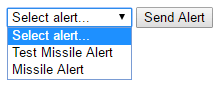
Of course, with hindsight, we can see the issues here. A member of staff that is used to the monotonous task of sending the test missile alert is likely not going to take his time to double check the correct box is ticked before sending it off. They’ve done it multiple times before without it going wrong, so why bother? Even the addition of a popup ‘are you sure’ message is likely to be ignored as the user has seen it all before.
Creating a user profile.
Already we’ve started one of the first stages of UX research – creating a user profile. Getting into the mindset of the user is crucial in finding the optimal flow through the software. So, what might the user profile look like in this situation?
- This user’s job is to send the test alert – he performs the task on a regular basis.
- His goal is simply to check the system is performing as expected.
- This is likely the first step of a large procedure to ensure the software integrity.
Digging deeper and flourishing this profile with specific details can really help us get into the head of this user, for example, it is likely this user’s job is one with a lot of responsibility this might cause extra stress or place time pressures on this task.
With this we can identify the problem – the monotony of the task coupled with external time pressures means this user will likely ignore any confirmation brushing it off as ‘seen it all before’.
Prioritisation
Another crucial part of UX Research Is prioritisation. It is by doing this that we define the main ‘motorways’ that the users will be on whilst using the software or website and can ensure that these are always traversed in the quickest way possible. It’s also important that the pathways through the service do not create extra work where there is no need for it. In this example we have two main uses for this section of the program: either the user wants to send a test alert, or a ‘real one’ and these are our main motorways.
Of course, the main priority of this example is the successful sending of a real missile alert when one is necessary. But the wrongful sending of an alert and the ability to test the service should not be ignored by any means. In this respect, we’ve identified the crucial functions this piece of software must perform.
With this, we can use our practical skills to design a solution that considers these priorities.
Effective Form Design
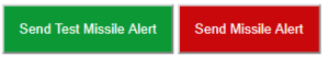
There are many elements at our disposal when designing forms but they are not always appropriate for the task. The select box here is a strange and unnecessary choice – the main task of this select box is to choose the action of the adjacent button. With only two options available to the user this could easily be replaced with two separate buttons that perform these tasks individually, ‘Send Test Missile Alert’ and ‘Send Missile Alert’. This not only eliminates one of the clicks necessary to send the alert but also separates the two ‘motorways’ and improves the tasks efficiency.
We could also make use of colour psychology here to imply the actions of the buttons further. A green to imply a more neutral response and red to invoke a warning. So, our process has produced the following design.
With just this relatively small amount of thought and research, we have not only increased the efficiency of the tasks but also reduced to scope for human error.
Continuous Development
With UX design there is no final ‘correct’ answer to the problem and it’s often the case that we are continually reviewing the progress of a website to identify areas for improvement, so I passed this example through the team at Formation to bounce ideas around. UX Designer Dan suggested enhancing the confirmation box ‘Are you Sure?’ with a more interactive element to prove it has been read and considered – this could be like Mailchimp’s setup who ask users to type the word ‘delete’ to confirm deletion of a campaign. UX Developer Simon suggests the colour choices could be reinforced further with exclamation icons.
Overall this example goes to show the importance of a proper user experience design process in any production process, seeing through the eyes of your user and identifying their pathways and potential issues ultimately leads to a more successful product. Take a look at your setup, are there any unnecessary roadblocks on the way to an enquiry? Can people find what they’re looking for? A bad user experience could be losing you sales.
At Formation, UX is at the heart of everything we do and is key to starting your business transformation. Contact us today.
