What is the role of serif typography in the digital age? – Who shot the Serif?
Now, one would think as a team of designers, copywriters and web developers, Formation would be primed and poised to answer such a question with the poignant accuracy of Richard Dawkins and the playful wit of Stephen Fry… But we weren’t. We didn’t know.
But we wanted to find out.
So, after a discussion (notably lacking in any hot takes or valuable insights of any kind) in which the only gem unearthed was this articles’ brilliant title, I was assigned the hefty job of writing my first article for Formation Media. The task: to gauge and report my findings on the use of serif typography in the digital age.
Serifs for dummies
Always good to start from the beginning. “What is a serif?!” I hear you shout loudly at me through my screen. Calm down. I’ll tell you…
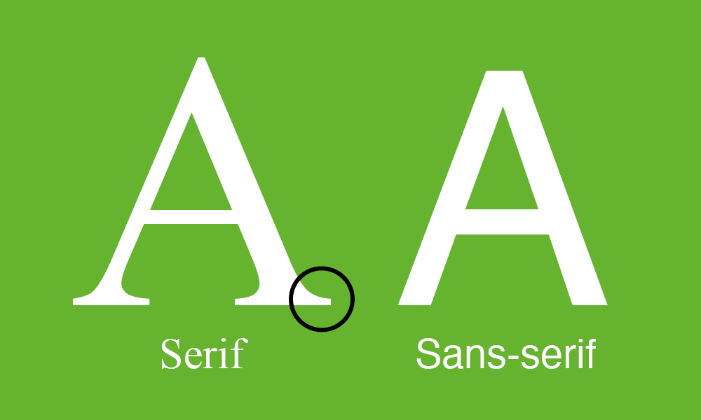
A serif is that cute little double-pointed shoe worn by the extremities of certain letters. Therefore, sans serif typefaces (sans being the Latin for without) are typefaces that walk around barefoot… To put it less obtusely, serifs are the little flicks or swishes that often protrude from the ends of letters. Sans serifs do not have these unnecessary details and look rather efficient and modern when compared to their more mature, aged-looking cousins, the serif faces.
I hear you roaring yet another well-placed, yet no less aggressive in tone question at me: “What are serifs for?!” To that, the answer is slightly more complex. It is very possible that against the backdrop of the digital age, serifs are more of an antiquated cultural affectation rather than an element of typography that provides something useful to us. Perhaps, but perhaps not…
Serifs for the slightly more advanced
It is widely believed that serifs originated from Roman calligraphy that was first painted onto surfaces by hand before being chiselled out of the wall. It is thought that serifs as we have come to know them, were once an indulgent Roman sign – a painter’s flourish of the wrist, if you will. Serifs, therefore, reflect the various eccentricities present in our own handwriting – a sentiment I find bizarre as serifs are notably absent from mine and everyone else’s who I know…
However! There is another part to this story that does make sense.
In an age before the Apple Mac, even before Gutenberg’s printing press, there was a time when all books, all copy had to be written… by hand. Shudder. In 2022, we take for granted the sheer quality, crispness and hardcore horizontality of the typography we see on our smartphones, newspaper articles, and touch-screen McDonalds menus. However, pre-1450, things were different. Every bit of text, commercial or otherwise had no choice but to be written out by hand. Things were not as clear and accurate as we have the luxury of seeing as normal nowadays. Ink ran, letters could vary in size or shape, and funnily enough, nothing was pixel-perfect.
Another problem that hand-letting opened the door for, was the potential for lines of type to appear wonky. Serifs are the perfect antidote to this dilemma. Each flick at the bottom of a letter links perfectly to the flick at the bottom of the following letter, almost like a linking chain of ink on paper. It creates the illusion of a consistent line and makes it clear which letter connects to which.
This reveals the hidden value of serifs; serifs are very easy to read. While it’s expedient (yet understandable) to find serifs “old fashioned” or even “past their prime”, serifs serve their function incredibly well. They are the most legible form of typography to use when it comes to long-form text.
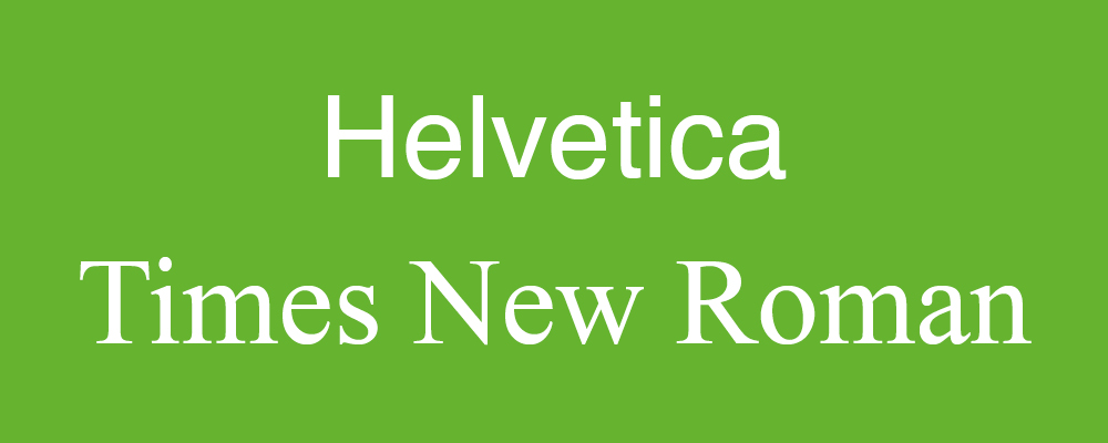
Take the two most widely and most deservedly used typefaces in the world, for example: Helvetica and Times New Roman. Helvetica is the sans serif crowning achievement of the Swiss graphic movement of the 1950s and Times New Roman is the visual backbone of The Times newspaper since 1931. While Helvetica dominates in digital and environmental usage, Times New Roman branched out from its roots as a font designed for and named after the Newspaper and is now the font that most novels and newspapers are printed in. Why? The same reason one would have used a serif 500 years ago; the letters on the page connect and therefore flow together. Sans serifs have no connecting shoes, so whether one is conscious of the effect or not, the starkness of their shapes force the reader’s eye to a halt. There is far less fluidity. Serifs, however, allow the eye to flow from letter to letter and therefore word to word, and therefore sentence to sentence.
But that’s the thing, now that it’s a rare day that you see someone whip out their chisel and carve letters into rock, now that lined paper has killed the need for the handwritten serif, and now that more people read off of their phone than from books, has the serif found itself in a state of Limbo? Might it be possible to argue that the very use of the serif has become unnecessary?
No.
Serifs are old-fashioned now; that much is for certain (especially if they originated from stone carving).
However, perhaps one shouldn’t be so quick to throw out serifs from typefaces as they would to throw out a baby with its bathwater. People who preached of the end of the printed word back in the 90s at the dawn of the computer age now have all the credibility of the cardboard-sign-doomsayer. In fact, it has been pointed out that while the book as a form of storing information has endured for hundreds, if not thousands of years, many modes of technology (such as the floppy disc for example) only had widespread usage lasting a couple of years. So, it is very possible that in the digital age, the serif font provides a ubiquitous function so frequently that we don’t even notice it when we see it in action. This function being that our books, newspapers, technical papers and more are legible and that serif typography is the best way to achieve this. Forget just printed books. The default font choice of Amazon’s Kindle is still a serif font. This is because legibility is required for the printed book just as much as it is still required for the digital book. Serifs, are still the best choice when it comes to long-form legibility both off and on-screen.
Serifs for experts!
So far, the usage of serif typography has been explored in terms of function, “but what about style?!” – I hear you ask, again, somehow even louder and with less patience than the first two times…
Well… That’s the thing. In terms of its usefulness, serif typography may still be going as strong as it ever did, however, in terms of its use stylistically, we are very much seeing it weeded out. The last ten years have seen a significant decrease in brands opting for serif typography. Notable examples of this have been brands such as Google and Spotify re-designing their logos to much more simplified, modernist versions of their previous logo. This behaviour is often seen when a brand finds itself recognised by name to the extent that it no longer needs a unique logo. At this point, the brand will opt for the cool, sexy, yet slightly untrustworthy and highly corporate look.
That’s the point: in this digital age, the serif is unwelcome on the screen. People associate it with old-fashionedness, antiquity. Its time is done. In this age of “Move fast and break things”, the serif is as static as the stone walls it was designed to be cut in. Anecdotally, I have been working as a designer here at Formation Media for just over a year and we have pitched a logo with a serif font only once. The serif doesn’t say: “moving forward towards a brave and exciting future”. It suggests classic-ness, old-fashioned-ness, conservatism. The serif is of another era and for another purpose.

The dwindling but ever-present aesthetic fetishisation of the serif in its post-modern, neo-capitalist context…
However, there are admittedly a few moments in the modern-day when one will see the mystical serif in the wild. This is typically when a company is trying deliberately to portray itself as a classier, more sophisticated and higher quality product.
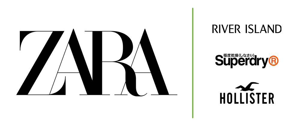
Take the fashion brand Zara for example. It uses serif typography in its logo and this imbues their brand with a seal of class, quality and the made-illusion of aged wisdom. It’s a sophisticated choice. When looking at the Zara logo, one feels that they can place their trust in a mysterious, sexy, powerful voice that they don’t quite understand, but it sultrily promises them high-quality threads. Against a backdrop of sans serif River Islands, SuperDrys and Hollisters, one notices that Zara seems to be trying to say something else with its choice of font.
However, this is a prime example of the point I’m making. Nowadays, when a brand opts for the use of a serif, they are making a very bold statement: “We are intentionally not using a sans serif. We are not like the others. We are different from them. Our products are better than theirs.” In choosing to be (what many would see as) conservative, they have, in fact, chosen to be radical. But make no mistake, this is a novel strategy, made only possible in the context of a design-scape in which the serif is becoming an increasingly rare sight.
Sans
While serifs remain as useful as ever for legibility purposes and always will, in 2022, 90% of the time, they are not the way companies wish to portray their brands. While it may be sad -outside of myself and other pretentious young (ish) graphic designers - the serif is not loved by many. It’s useful, but visually, the serif points back towards the past and in an ever future-focused world, it is incapable of speaking with the correct voice and values as us and therefore has to be cancelled…
Serifs will always have a loving home in our books and our reading material, but in terms of design, people look at them with the eyes of an ageist.