The Power of A Good Logo
On more than one occasion, you've probably been going somewhere, and you've passed a business's logo and thought to yourself, 'oh, that's [insert company name here]'.
Your logo is often the first thing your audience will see when they encounter your company. This is the opportunity to make a good first impression and encourage them to become a potential customer. Your logo is a vital part of your brand awareness and becomes the main connection between you and your customers while they are out and about.
Properties of good logo design
Simple Design
Your logo will become the face of your business, and as such, you should keep it simple. This will not only help you make your logo memorable; it will also keep your brand looking clean and uncluttered. For example, a simple design could mean only including a few colours the design or using a basic shape.
Keeping your logo simple will make it easier (and likely cheaper) to get printed onto stationery and apparel.
Colour scheme
The colours you choose to use can affect your audience. Where this is subliminal, a colour can symbolise a concept or vocalise a message that you want to convey.
For example, red can depict a range of emotions, including passion, energy and aggression. You'll probably find that many of the companies who utilise this colour are sports or fast-food businesses. As red has been thought to increase our heart rates and subsequently our appetites.
Whereas companies incorporating blue into their logo might be trying to demonstrate their trustworthiness to their customers. Blue has been shown to represent loyalty and professionalism. A lot of companies use it to effectively pass on messages about their reputation to their audiences.
You can utilise colour psychology in your marketing campaign to appeal to your target audience; take a look at our colour psychology article to learn more.
Shape
Shapes play different roles in your; design. They can be used to frame your brand's name or incorporated into the overall design.
As with colours, the shape can also represent your brand values. For example, using an edged shape (square or triangle) represents your business's strength and stability. Edged shapes can also convey to your audience that you are professional and efficient and are synonymous with masculinity.
The circular shape gives the impression of community and represent relationships. Circles and curves also demonstrate femininity and are a popular choice with products targeting women.
Triangles show that you are balanced; they can also indicate community, science and logic within your business.
Bad logo examples
We've all seen a company or product logo that has made us take a second look, and not always for good reasons. A recent example would be the episodes of The Apprentice, where the contestants were creating brands, and marketing a line of baby food and a luxury cruise.
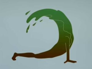
One of the teams created a logo for a luxury cruise. After hearing them talk about the logo and what they aimed to get out of it, it's easy to understand that they wanted something that reflected the experience a guest would have on the cruise.
The yoga pose was intended to represent a relaxing time, while surrounded by the tranquil sea (the wave).
Unfortunately, this wasn't the impression that made it to the audience, with many people taking to social media and comparing it to a 'turd' or a 'mouldy banana', which shows that the logo failed to convey the desired message.
In another week, they were tasked with developing baby food, and the packaging.

With this one, in particular, they wanted to tap into the foodie community and make a baby food that would appeal to them, which led them to the product name 'First-time foodies'.
Where this would have been fine as plain text. The team decided that they were going to change the 'o' in foodies and change it to a bowl of food.
Although a clever idea, in theory, the outline of the ‘o's’ was lost in the design, so the packaging appears to read 'First time f Dies'.
During the presentation to retailers, this was the first thing they noticed, commenting that parents are unlikely to buy their children food that says 'first time dies' on the packaging.
Having a logo that represents your company values and effectively conveys your brand message is imperative. Your logo is the first thing that your audience will see when they encounter your brand for the first time, whether that is on social media, on your website, or out in the high street and the supermarket. You don’t get a second chance at a first impression!
Here at Formation, we can help you rebrand your business and create a logo that will get you noticed. Get in touch with one of the team here, or phone us on 01926 298 777.
