
Contact forms are often the main call to action throughout your website - they’re easy to neglect in favour of describing your company or selling your services, but if your contact forms are confusing, overly long or broken, that content quickly becomes worthless.
Here are some top tips to maximise enquiries throughout your website by improving its user experience:
1) Keep it simple
At the heart of UX is the idea of placing yourself in the shoes of your users. Your user doesn’t want to fight through a survey of input fields to get their question answered. Equally, they don’t care that you want to know ‘where they heard of you’ and they’re certainly not bothered about the ‘title’ you should use to address them!
It’s important to streamline your form and not overwhelm users with the sheer size of it. (FYI, this probably includes your newsletter signup checkbox!)
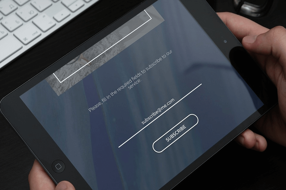
Start with the basics: name, email and message – this is probably all you’ll need to get back to the user with an answer.
Now, start to think about your audience; do the additional fields you want to add provide any additional value? Even before adding a space for a phone number, consider whether your audience is likely to want a callback or would perhaps prefer to communicate via email.
Ask yourself what information you really need from your user. This is especially worthy of consideration with the upcoming GDPR legislation – only take the identifiable information you need!
2) Anticipate your users – Houghton International
There might be ways for your contact forms to anticipate the input or selection of a field before the user even begins - we have successfully implemented this train of thought on a client’s website – Houghton International.
The form on Houghton’s contact page asks the user to select either a product or service related to their enquiry (if appropriate). This field provides value by directing the message to the correct member of staff as quickly as possible – this trumps sending a basic email message every time, with the user feeling happier that not only is their question relevant, but they’re communicating it to the right person and in the right way to get an answer.
There’s an easy way to anticipate what the user’s query might be relating to, and that involves reviewing their journey through the site. In Houghton’s case, if the user were to hit the ‘enquire’ button on the ‘Fluidcare’ page, it’s likely their query is related to this particular service. So, if you click this particular enquire button, the contact form will automatically have Fluidcare selected in the service drop-down – eliminating the need for the user to fill this out and ultimately enhancing their experience.
3) Keep it accessible
Follow the three main rules of form design to prevent confusion and avoid client frustration.

- Use only one column - don’t let users get lost in a sea of input fields all squashed into one, small, frustrating, space.
- Label placement - Every field should have a label and that label should be placed above the related field – you don’t want your user confused over what information they’re meant to be giving with weirdly aligned labels or instructions that disappear while they’re typing.
- Clear boxes and focus - All your input fields should have a clear border and be large enough to click or tap into focus – it should be obvious to the user what field they’re about to input information into
4) Describe and reassure
Introduce your contact forms - describe where the user's information and message is going and for how long you’ll be storing it. This will not only reassure your user but also make sure you’re aligning with new GDPR legislation.
Make sure your required fields are appropriately marked and the labels descriptive enough to facilitate the user’s webpage ‘glance through’ before they decide to use the form.
Get yourself an SSL certificate and make sure your site is secure. You can always tell a secure website by the padlock in the address bar alongside the ‘https://’ – browsers such as Firefox and Google Chrome are even beginning to point out sites that aren’t secure. This will not only build up trust with your users, you might even get a rankings boost from Google as well.
5) Continually develop
I’ve written a lot here about users and their journey through site to contact forms, but it’s impossible to guess the unique pathways your specific users will take, and what will affect them. Make sure your site is set up with appropriate analytics to collect data - not only on your contact form but on your whole site also. Heatmaps and screen recordings are a good idea alongside setting targets and goals in tools such as Google Analytics.
Don’t be put off asking for user feedback - just make sure it’s not in the user’s way of achieving their goal. Perhaps ask for a rating or comment following a successful contact form submission, or of course, you could always ask during a follow up what they thought of the site. There’s plenty of unobtrusive options to choose from.
Finally, use this data! Assess, evaluate and improve the experience – there’s always something that can be done to make your website perform better.
Start employing these tips on your site and your contact form will be more efficient in no time. And when you’re ready for the next level, make sure you get in touch with us here at Formation, where we’ll be ready to supercharge your digital presence and transform your business.
Contact us via our website or ring us on 01926 298 777.
