2023 is a creative’s existential limbo – Change my mind, or is the modern era a good time to be a creative?
Part 1 – Social Media
Welcome to bold statement town. Population; me.
This time, I have chosen a subject perhaps so broad and varied, so open to interpretations from both sides, that I am now struggling to introduce the very premise of my thoughts.
2023 is an interesting time to be alive. AI showing us what we would look like if we were anime, mysterious and definitely not Chinese balloons appearing in the American sky, the domestication of the dog still continuing unabated… It’s all great!
With all this amazing stuff that even the writers of Back to the Future 2 were unable to imagine, it would be natural to wonder; “What kind of ungrateful, bitter man-child could possibly have the nerve to complain about living in this golden age of culture and innovation?”
That’s where I come in…
Personal Stake
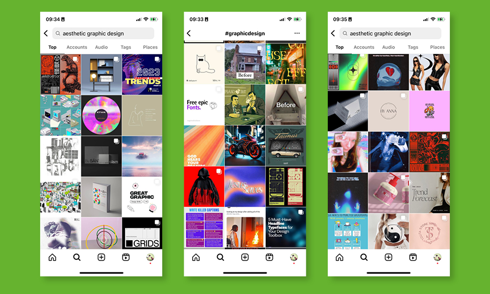
Just before I graduated university, I began to notice something strange… Whenever I went on Instagram to look at graphic design, I couldn’t help but notice something that made me rather uncomfortable: it all looked the same…
The words were different, the subjects at hand were different, the products and events being advertised were all different. But visually, everything looked the same.
Then, over the span of one year, I noticed another strange thing happen… graphic design on Instagram seemed to transition from one style of looking the same, to another style of looking the same. My feed, once filled with colourful digital collages of leaves and natural elements, topped with text in Akzidenz Grotesk font as big as it could fit on the page, had been replaced.
Now, instead, my eyes were assaulted with unusable custom fonts, thin lines, arbitrary grids, randomised shapes, the recurring motif of Italian sculpture and the word “aesthetic” repeated so frequently that I became unsure that myself, or anyone else for that matter, comprehended the word as was meant.
It’s only recently we’ve seen a shift away from this faux-vaporwave style and begun to see the veneration of the Y2K, early computer graphics that were around in the super-early 2000’s done by the likes of the Designers Republic. (A shift, I might add, that I am particularly salty about as I was once a great fan and can now no longer pastiche, as a matter of pride.)
But, as is to be expected, once a design choice ascends itself to the level of trend no sooner has it begun than another style becomes derivative.
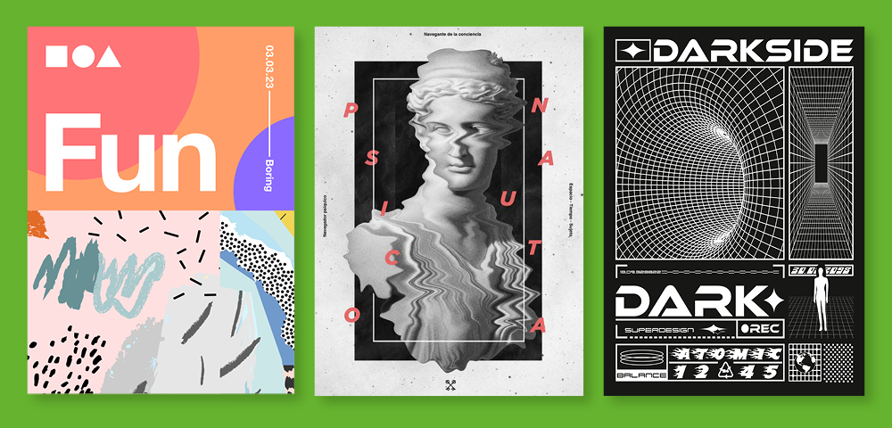
(When I sat down to write this article, I considered re-creating these three styles to serve as examples. However, as it turned out, there was no need. The three styles in question have done such a good job of becoming bland and derivative, that you can literally search for them as stock images…)
So…
How could we have found ourselves here?
Logged inside
Trend has always influenced design and creativity, that much is certain. However, I have an alternate theory as to why this phenomenon could be happening.
In a world where young creatives have been predominantly raised online (I am no exception to this), they are going to the same sources for design inspiration. The algorithm on sites such as Instagram and Pinterest increasingly show designs that are popular, and as The echo chamber theory has proven, once one is locked into seeing certain kinds of content, it’s very difficult to imagine a world that does not look like the one that the internet has crafted around them.
The algorithm has started playing a large part in defining what good design looks like to a critical mass of people and has, to a large degree, stunted genuine, organic creative variety.
It has come to a point where these trends are seen so ubiquitously, and the pool of design one can observe online is so limited, that these design trends have almost transcended subjectivity and are now seen by the modern designer as an objectively good standard to aspire toward, hence their adoption by most designers.
To me, now, whenever I see a design piece that has not opted for any of these visual choices, I can’t help but find it comparatively brave.
What’s your point?
I wish to investigate through my indulgent, semi-regular blog that my boss at Formation has kindly bequeathed to me, some of the current digital phenomenon that are influencing creativity in 2023 and whether or not this is having a positive or negative effect on creativity as a whole.
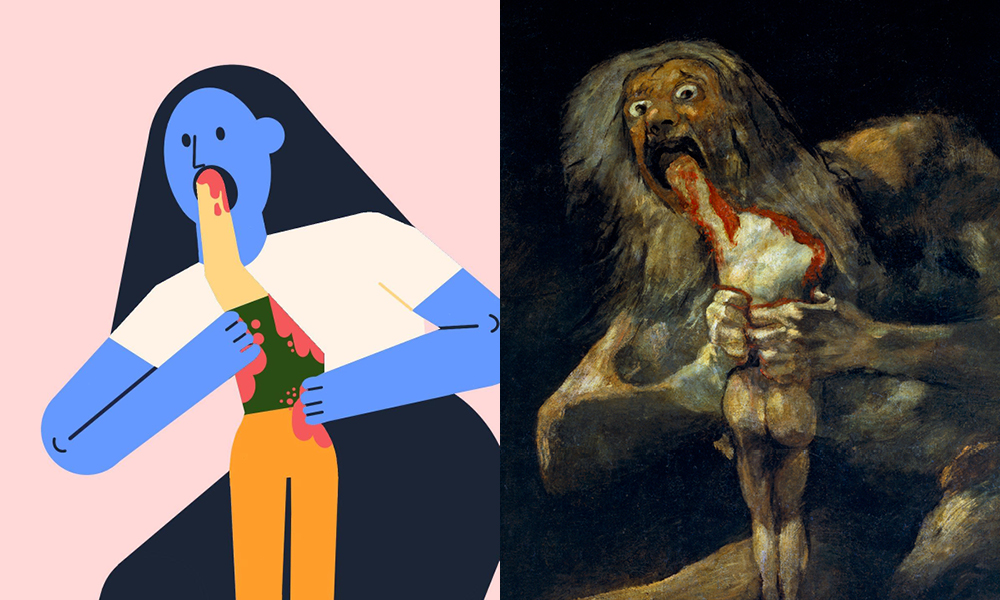
Let us begin with something funny. Best to just show this rather than explain:
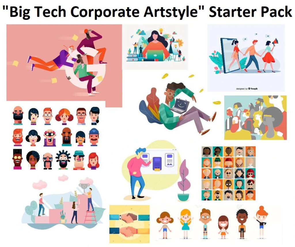
Corporate Memphis art-style
The famous “Corporate Memphis” more commonly referred to as “The big-tech corporate art style”, is probably one of the examples that you're likely to have seen.
The Corporate art style started to gain widespread use in the late 2010’s and early 2020’s. It grew naturally as an illustration style from the use of vector-based illustration applications such as Adobe Illustrator. Its bold character figures, bright colour choices and metaphorical imagery allow it to convey human connection and activity incredibly efficiently and emotively.
“But, Willem, what’s wrong with that?”
Well… Nothing… Except, maybe… In 2017, the style of illustration was adopted by Facebook. By doing this, Facebook opened the floodgates. As the leader in the tech landscape, Facebook has the luxury of being the cool-kid at school who comes in with an earring one day, and is unshocked to find that the next week, everyone else has gotten one of their own. (The same thing did not happen when I started painting my nails at 17.)
In your Facebook
Since becoming commonplace among social media companies and tech start-ups, the Corporate Memphis art-style has been the target of a great deal of online criticism for being bland, lazy, derivative, and failing in its main objective; to appear human.
The art-style is now largely used as evidence to prove that big-tech companies refuse to rattle the cage and be original. Not only is the art-style now seen as the cliched creative direction for big-tech companies, but people bearing witness to the big-tech art-style can also smell a rather large rat…
In recent years, it has come to light that these huge, silicon-valley tech empires do not have the community-at-large’s best interest at heart. As the saying goes “If you are not paying for the product, you are the product.” The social media giants are selling our data to advertisers and then having the nerve to argue that this behaviour is not only justified but for our own benefit.
This in mind, it is obvious as to why these social media companies would default to an art style that insists on its own cuddly wholesomeness and emphasis on human connection. The gaslighting is real.
Coming full circle
“What does this have to do with the decline of creativity?” I hear you ask. Facebook’s net-worth as of January 2023 is £320 Billion. It’s huge. It has wealth, as my mother would describe; “beyond avarice” and therefore has to be considered more influential in contributing to a world culture in 2023 than most countries are.
The snowball effect created by Facebook’s adoption of this art style has led to some rather anxiety-inducing observations about the creative economy in late-stage capitalism. Not only do big-tech companies trying desperately to implore their own innocence use this art-style, but the infection has spread to smaller companies and independent hipster business riding the wave as well.
If you see something everywhere, you might become convinced that it is an objective standard of quality, and thus, the loop continues and just as soon as you’ve become conscious of big-tech art-style, you’ve already become sick of seeing it. Ergo: trend.
When Facebook opted to use this art-style, its fate was sealed. No longer would it be known as Corporate Memphis… From now on, it would be known as the Big-Tech art style…
Guilty by association
While this is definitely the case, I feel it only right to point out something else. Most of the hate this art-style receives is not because it is bad. In fact, this art-style is pretty good… The drawings are nice. Formation has even used them before in a project we did last year. However, being attached to social media and big-tech as intimately as it is, has allowed a once quite viable and visually quite lovely art-style to be infected with negative connotations of untrustworthiness, vapidity and derivativity.
When one sees it now, they feel tired, unchallenged. It’s boring. It’s been ruined for everybody. Just like all visual identities, the art-style under scrutiny is going to be tied to the brand using it. Corporate Memphis has become guilty by association and is disliked only for being linked with companies that have done bad things.
The knock-on effect this has had on creative culture is huge, and not because the art-syle itself is bad. Remember: it’s not the blue skinned, vectorised depiction of a thicc floating woman playing a giant game of noughts and crosses that stole your data… It’s Mark Zuckerburg.
And it’s not the fault of Corporate-Memphis’s that the big players using it to depict their brands are perhaps a bit it shady.
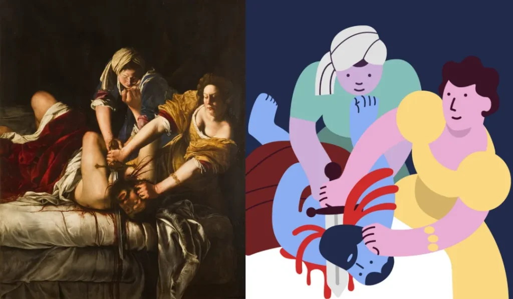
While it was once an effective, praiseworthy style of art, it has most definitely been corrupted. One of the satirical parodies I find to be a most effective commentary on this artistic style, is its use to recreate some of the more violent scenes from classical paintings. When presented like this, the message is clear.
The Big-Tech art style is not a medium in which creative bravery or effective artistic experimentation flourishes. It has become, through little fault of its own, a corrupting, coddling, common medium that strips our minds of adventure and risk when we behold it.
Conclusion:
The fate of Corporate Memphis grapples perfectly with the posed question at the start of the article: “is the digital era a good time to be a creative?”
It highlights the struggles, dangers, and potential consequences of creative expression in the digital age. It shows that creativity is often swimming against the context in which it resides. The very era that popularised Corporate Memphis and the conditions under which it was able to become a popular art style, are also its enemy.
It was a good form of creative expression. But it was ruined by the digital era.
If you’re looking for inspirational design ideas to make your business stand out from the masses, get in touch today!